Advertisement
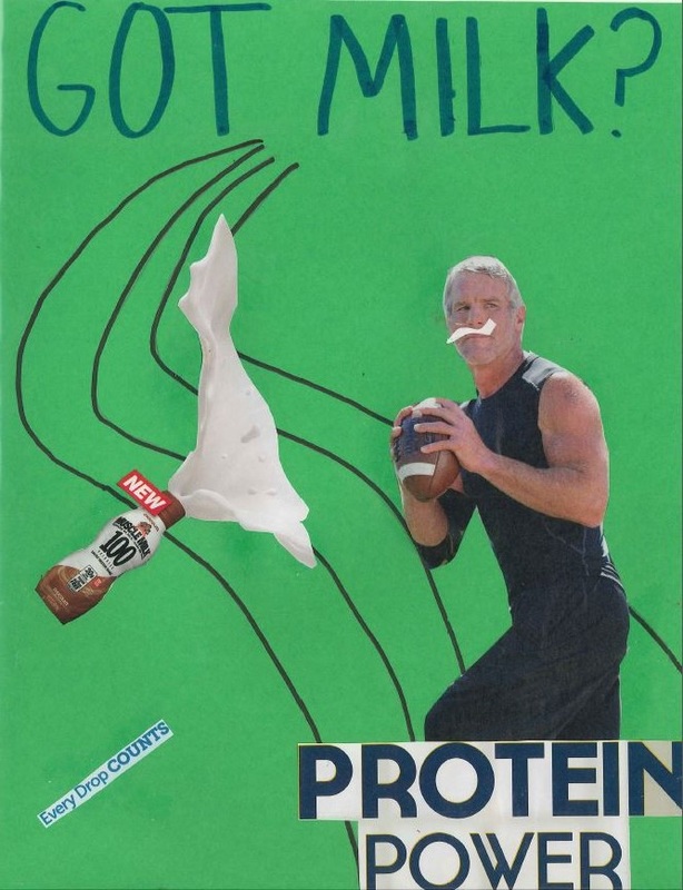
For our first assignment we had to make a magazine advertisement. I made a "Got Milk" advertisement for this assignment.
The elements and principles that are most prominent in this ad are line and emphasis. Line is a clear element because the
background has lines that makes your eyes follow up the the title. Also, the milk spilling makes your eyes go right to the title.
Emphasis is a principle that is present in this ad because the lines that make your go up to the title give it emphasis.
The title over the guy holding the football also creates emphasis on the "protein power". Another element that is present in this ad
is color. Color is a good element in this because there is a color scheme which consists of the colors green, white, blue and a little black.
In this assignment, I learned that creating something that draws someone's attention is the best way to go. I learned that
key elements like color, balance, line and emphasis can make a huge difference in how successful your ad is.
Flyers
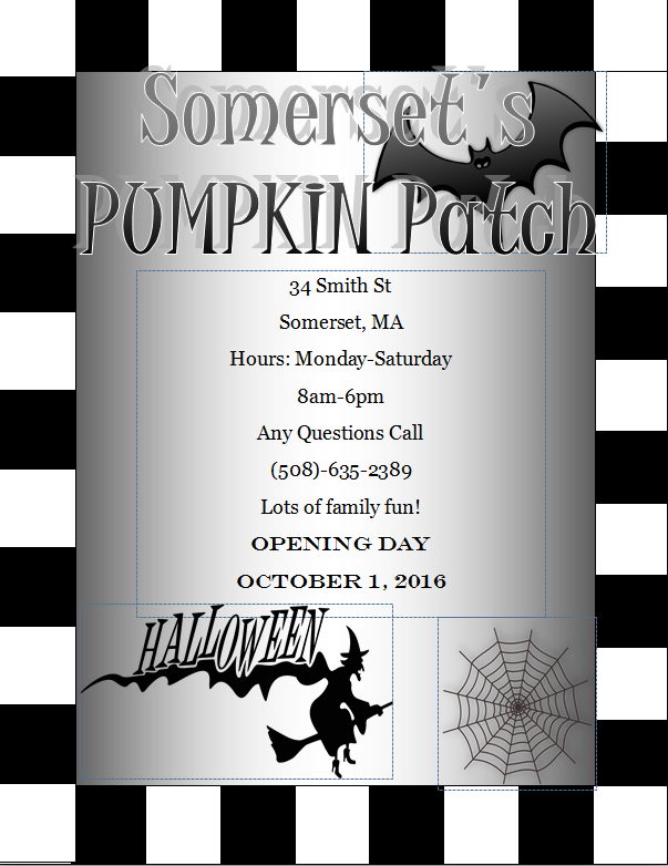
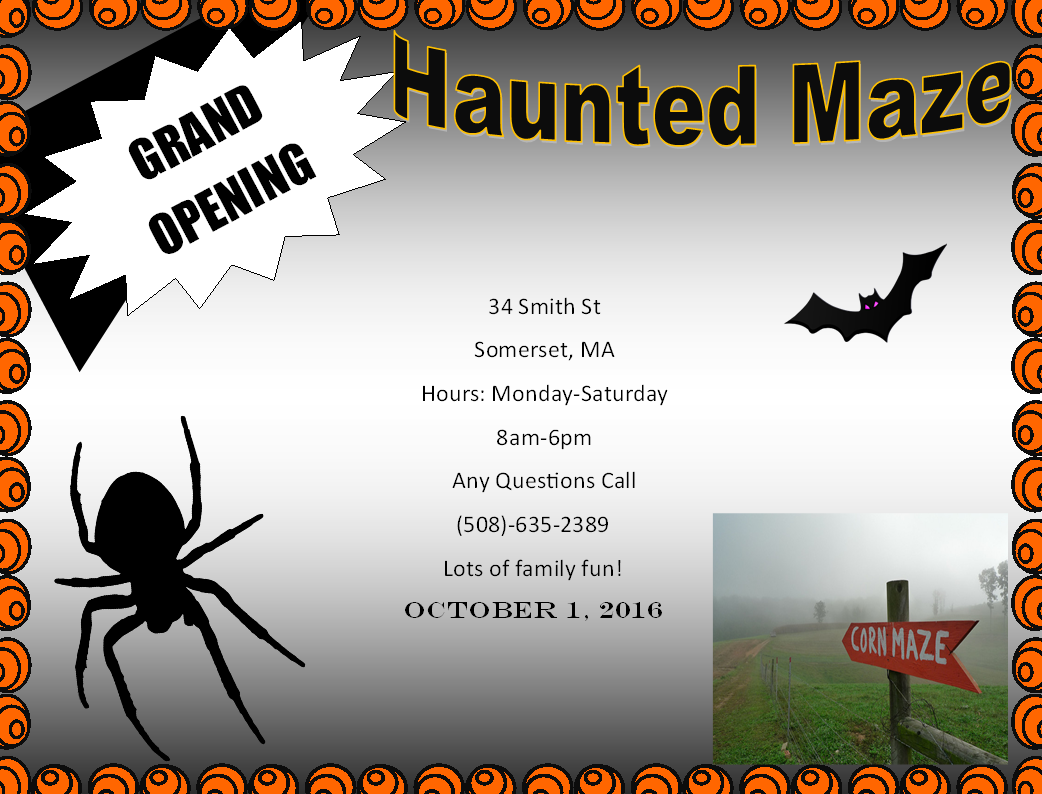
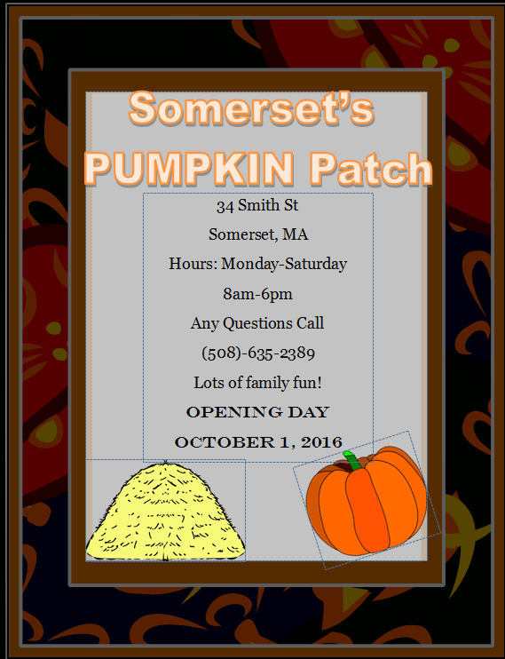
In this assignment I learned how to make 3 similar flyers look different and have different formats.
I created the first flyer in this grouping as a black and white flyer and I created it from scratch.
The second flyer I also created from scratch, but put it in landscape and used color. For the third flyer,
I was able to use a template and I used clip art and word art to make all the flyers appealing.
A few things I learned in this project is how to use word art. clip art, and borders to make the flyer more appealing.
Brochure
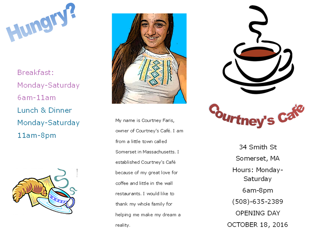
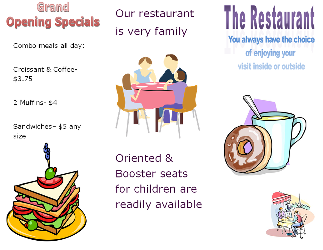
In this project we were assigned to make a tri-fold brochure of a company we made up.
I created Courtney's Cafe to be my industry of choice. A few things I learned in this project is
how to edit a picture to make the background gone, how to make 2 separate pages turn into 1.
I also learned how to fold a paper with a machine.
I created Courtney's Cafe to be my industry of choice. A few things I learned in this project is
how to edit a picture to make the background gone, how to make 2 separate pages turn into 1.
I also learned how to fold a paper with a machine.
Greeting Card
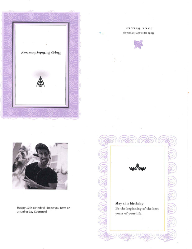
We were assigned to make a greeting card from a celebrity and use 5 photoshop tools.
The 5 tools I used were adjusting the levels, grayscale, twirl, blur, and smudge.
The 5 tools I used were adjusting the levels, grayscale, twirl, blur, and smudge.
Thayer St. Field Trip
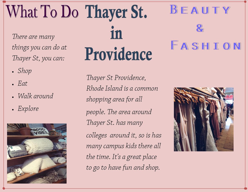
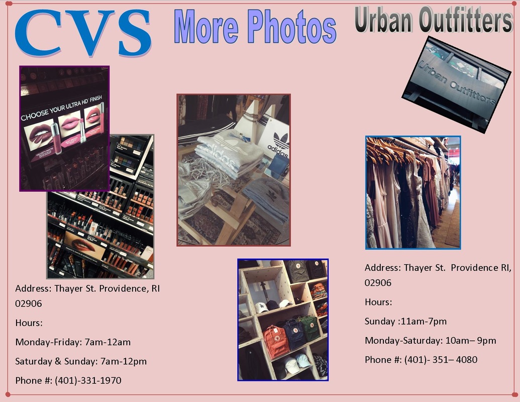
For this project we went on a field trip to Thayer St. in Providence, RI. Every group was given a
topic to focus on and my topic was Beauty and Fashion. For beauty and fashion we took pictures of clothes
and make in Urban Outfitters and CVS. It was very interesting to see how different the two stores were, but still promote beauty
and fashion.
topic to focus on and my topic was Beauty and Fashion. For beauty and fashion we took pictures of clothes
and make in Urban Outfitters and CVS. It was very interesting to see how different the two stores were, but still promote beauty
and fashion.
